
I wanted to share a trick I learned while creating the new WP Theme for my wife’s website www.wellenberg.nl . For the design I started a contest at 99designs.com that led to a great design in PSD for all the pages I needed.
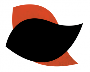
 The design contained an floral image shape (left to the main text) that was very nice, but it would be awesome if it were dynamic. My idea was that my wife should be able to select the image in the WP backend, and it would automagically be inserted into the shape.
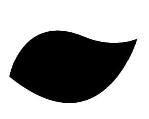
CSS masking seemed the perfect solution to solve this. Masking would allow for the selected image to be cut out in the center shape of the main image. The easiest solution (I’ m lazy by nature) would be if I just could make the center of the shape black and use that as a mask. Resulting in this shape:
The CSS I used for masking the contents of the img tag was this
.floral-img {
  margin: 20px auto;
  display: block;
  max-width: 400px;
  height: 320px;
  mask-image: url("../images/floral-mask.png");
  mask-position: center center;
  mask-size: cover;
  mask-repeat: no-repeat;
  mask-mode: alpha;
}
However this did not work, resulting in nothing more than a blank space. The coloured elements in the .png made it impossible to use the whole .png as an image mask. However if I just used the black centerpiece as a mask it did mask out the image. So this led me to the next solution.
I created two separate images. One outer .png image containing the coloured shapes and one black .png I used to mask the main image.

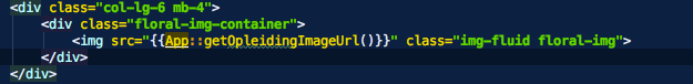
I then created an image wrapper div .floral-img-container with the coloured PNG as a background using
HTML:
SCSS:
.floral-img-container {
  max-width: 400px;
  height: 320px;
  background-image: url('../images/floral-mask-bg.png');
  background-repeat: no-repeat;
  background-size: cover;

  .floral-img {
    margin: 20px auto;
    display: block;
    max-width: 400px;
    height: 320px;
    mask-image: url("../images/floral-mask.png");
    mask-position: center center;
    mask-size: cover;
    mask-repeat: no-repeat;
    mask-mode: alpha;
  }
}
So using the coloured PNG as a background for the wrapper and masking the main image with the mask shape made everything fitted nicely together. In this case all elements share the same fixed width to make them fit, so in terms of responsive design this solution could be improved, but the end result is just what I needed.